
In anticipation of the opening of his third tattoo studio, Sang Bleu LA, contemporary tattoo behemoth Maxime Plescia-Büchi discusses aesthetics and the potentially tumultuous state of tattooing.
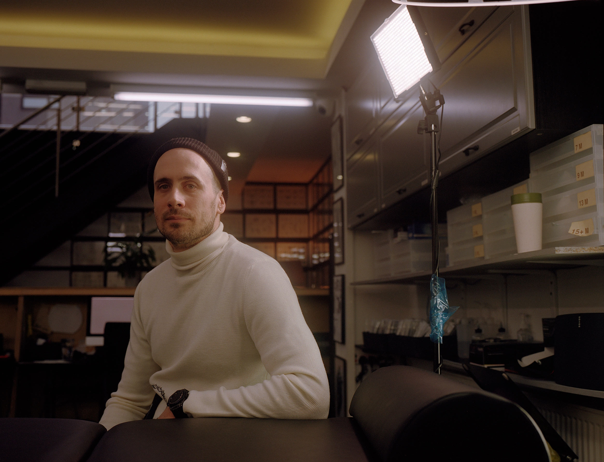
Maxime Plescia-Büchi has only been tattooing for 12 years, but he is now one of the most trusted voices in contemporary tattooing. Maxime is originally from the sleepy town of Lausanne, Switzerland where he relished in the antiquities which surrounded him. After studying graphic design at ECAL, Maxime settled semi-permanently in London. He began his tattoo career under the famed Filip Leu before founding his creative agency and corresponding tattoo studios under the name of Sang Bleu. Maxim has tattooed Kanye, and collaborated with everyone from Rick Owens to Pusha T. His signature style, riddled with symbols, architectural motifs, and ancient iconography, has become synonymous with the aesthetics of contemporary tattooing.
As tattooing becomes less of a subculture and more of a global obsession, documenting and preserving its cultural roots seems increasingly rare. In response to this, Maxime founded the publication TTTISM (Tattooism), which has blossomed into a biannual survey of the artists making waves in the industry. His other projects include Swiss Typefaces, a radical attempt to reconstruct typography, which has pioneered services like free trials, which have now become standard in typeface companies globally. His work is captivating and endearingly inclusive—the community created by Maxime’s Sang Bleu grows daily and serves as an important reminder that cultural movements aren’t about materiality, aesthetics, or apparent coherence—they are about people..

David Brake—I’m interested in how you curated such an immersive community that has tattooing at its core but takes inspiration from all kinds of subcultures—skating, fashion, and hip-hop. I know that Sang Bleu started as a publication, but now it’s turned into much more than that. So how do you manage to create such a unified aesthetic that still remains tangible?
Maxime Plescia-Büchi—I was a kid in the 80s, but I remember seeing the different subcultures back then. You’d have punk rockers, the goths, raves—and those people stayed together, you pledge allegiance to a certain subculture—it defined the way you dressed, the music you listened to, etc. And people didn’t cross over so much, whereas today, and even when I was starting Sang Bleu magazine, so 12 years ago, people kind of didn’t care anymore. The older [generation] maybe still had a certain loyalty to a certain thing, but people my age or younger didn’t care so much. They were just cherry picking—a bit of music here, a bit of music there, certain fashion elements here, certain intellectual elements there. They just composed their own, much more holistic approach to culture in general. I completely subscribe to this always in my life and I wanted to create a media, a magazine, that represented that. I used graphic design and art direction to essentially force a coherence to make a point.
Fast forward to today—we went from talking about things to doing those things. This is pretty much where it went. It’s not ‘I’ anymore, it’s myself, my wife, we have dozens of people working with us, and now it’s turned into a relatively large project. The real central point of all of it is a community. It’s a group of people who are doing it with a much larger group of people that are following, supporting, and carrying it. But the people really are the coherence. The coherence is not in the style, the coherence is not in a visual or aesthetic thing or theme in itself. I think Sang Bleu could do politics, could do banking, all of it, as long as we stay true to who we are, and the values that we put in all the things we do. It’s a weird thing between a family and a community.
David—Your work often contains ancient symbols, patterns, and iconography. Why are you drawn to these? How did your interest in those topics begin?
Maxime—[Symbols] are ubiquitous. When billions of people throughout history have constantly connected a certain meaning to a certain shape, the shape becomes a symbol, and symbols are powerful. They affect all of us all the time. I can thank my parents for instilling in me reasonable doubt as a way to go through life: to question and understand everything, to never take anything at face value. So that’s where it all started. Later in life, as I started to be interested in tattooing, I spent a lot of time wondering why a certain tattoo is good, why another one is bad. Beyond the formal aspects, the questions of meaning and symbolism are crucial. The decision-making process is very specific and a lot of things that might seem a good idea for a moment don’t survive the test of time. To compare with other practices, you need to approach getting a tattoo like you approach buying a house, not buying a shirt. And in the same way, you need to design a tattoo like you would design a building, not a fashion collection. And it’s with these two elements that I started to realize that using not only symbols, but iconography in general—taken from art or simply history—would be a good place to start creating my own formal and semantic vocabulary as a tattoo artist.

David—I seemed to notice in your tattooing style references to other established genres of tattooing: Japanese styles, Russian prison tattoos, Eastern iconography. How have other genres of tattooing contributed to the development of your style?
Maxime—I believe that when you do something as special and serious as tattooing, you are, yourself, a guarantor of your own seriousness. That is manifested by your own tattoos, but also, by your ability to deeply connect with and understand the iconography you produce. I wanted to work with things that were meaningful to me on a personal level. And those were not Japanese or sailor tattoos. I could appreciate and love those styles, but I wouldn’t have been the right person to produce such styles: I grew up far from the sea and even farther from Asia. So I naturally wondered, ‘What would an equivalent be for me?’ I realized that no existing tattoo style at the time [the late 2000s] really ticked those boxes. I needed to come up with my own style. I took what I knew best—central-European art history—and tried to adapt it to tattooing.
David—How did Swiss Typefaces come about? Have you always had an interest in typography? What were your intentions behind the agency?
Maxime—My father is a journalist, and I grew up in a very scholarly environment, so text, books, and publishing were omnipresent subjects of conversation. Then as a teen I got into graffiti and became obsessed with branding under all of its forms. Later I went to art school and started to understand what graphic design and typography are, and I quickly grew an obsession with the shapes of letters and how they came to be, but also how they influence our visual environment constantly. They are the building blocks of our graphic environment, like construction materials are of our urban environments. If you go somewhere where they use more wood than concrete, you might not know why, but you will notice that the place feels visually different just because of this. Same with typography.


